Build Your First Website
A Guide to Getting Started with HTML
Adding Navigation and a Footer
Lesson Directory
Goals
Add navigation and a footer to your website.
Objectives
- Add navigation using navelements and a list element
- Add links to our nav
- Use flexbox to style our nav
- Change the colors of nav using CSS
- Add a footer to our website
- Use flexbox to add a footer
- Choose a license for our content
Steps
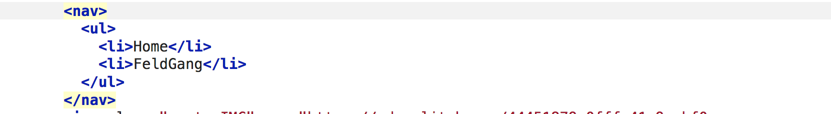
Add a NAV section
We use the HTML <nav> element to identify a section of a page whose purpose is to provide navigation links. These can be to your website or to pages on other websites. People use the <nav> for menus, tables of contents, and indexes.
- First build a list inside the <nav>. Include a list item for each page on your website.
- Your webpage will now look like:
- We will now add links to the pages.
- Add an <a> in between the <li> and < /li> for each page in your website
- Your have built a website. Call it quits omn the plumbing and just start adding content.
- You can keep adding pages and then adding these pages to your nav
- You can also learn to style your nav using flexbox and build a responsive, that means works on any screen website.


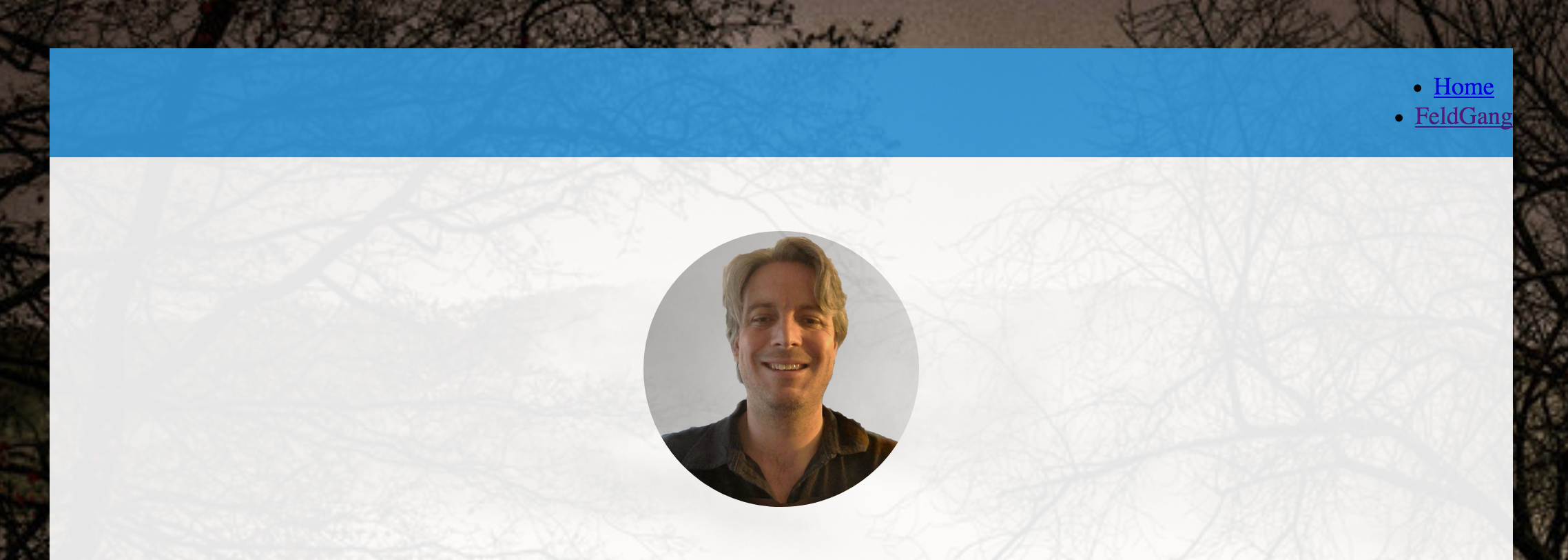
Style your NAV with Flexbox
We will use flexbox to make our nav bar. We will also add media queries so our nav bar changes based on the size of the screen. The CSS gets advanced so we tried to spell out the steps and define most terms for you.
- Go to your stylesheet.
- We need to set the display of the nav element to flex.
- We can then change the background color. You can use any color you want. In our example we match our footer color to other colors already used on the page.
- Our nav will now have the links on the left because of flex-end. This tells the browser to put the items at the end of the box. You can also use:
- flex-start
- center
- strecth
- Try them each and choose the layout you like best.
- Next we want to remove the bullet points in our list items.
- We also do want the items in a vertical list.
- add the following to your stylesheet
- list-style: none tells the browser not to add anything to the items.
- display: inline-block makes the items display horizontally
- Now we want to make the links prettier. Let us start by making the links white and removing the underline.
- Next let us add a bit of space between the links
- You may even want to add borders around the links to make them stand out
- In the above example we added a 1 pixel border to the top and bottom. If you want the the border all the way around the link just remove"-top" and then delete the rule for border-bottom
- You can change the color, the pixel size of the border or the border style
- Using the CSS rules above your nav element will now look like:
- Next we can add a bit of CSS animation for when we hover over a link
- This will change the color. To choose the color I Googled the hex number
- Next we add a media query so our nav works nice on all devices
- Copy the following code into your stylesheet
- This is two media queries. One for screens smaller than 600 picelx and one for screens smaller than 800 pixels
- For the screens up to 800 we use space-around our links
- For screens up to 600 pixels big we set the flex to wrap into a column
- In the image above you see the nav on a mobile screen with the cursor hovering on a link. In the below image you see the same navigation but on a desktop
              nav {

  background: #3498db;

  display:flex;

  justify-content: flex-end;

}
              nav {

  background: #3498db;

  display:flex;

  justify-content: flex-end;

}
              nav li{

  list-style: none;

  display: inline-block;

}

              nav a {

  text-decoration: none;

  color: white;

  text-align: center;


}
              nav a {

  text-decoration: none;

  color: white;

  text-align: center;

                margin-right: .5em;

}
              nav a {

  text-decoration: none;

  color: white;

  text-align: center;

                margin-right: .5em;

                 border-top: 1px solid #34dbcb;

    border-bottom: 1px solid #34dbcb;

}

              nav a:hover {

              background: #7f8c8d;

}
              @media all and (max-width: 800px) {

  nav{

    justify-content: space-around;

  }

}


@media all and (max-width: 600px) {

  nav {

    flex-wrap:wrap;
  }


  nav li:last-of-type a {

    border-bottom: none;

  }

}

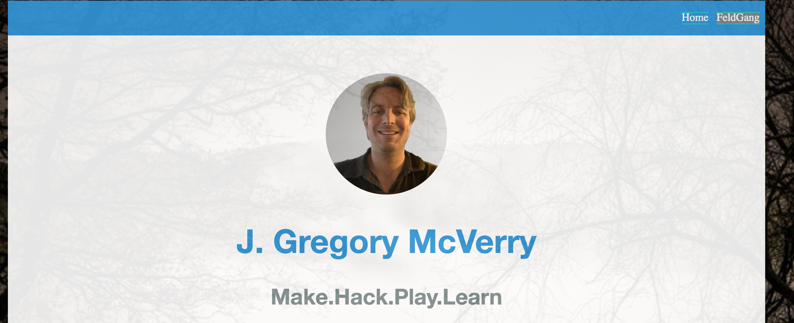
Add a Footer to Your Website with Flexbox
- We will now use the Footer element
- Author's often use a footer to include contact inforamtion, social media links or licensing.
- You will place the footer before the DIV with the "wrapper" CSS Selector closes. This means you are putting directly below the content. Our website will now have header, main area, and footer
- Return to your HTML File and add "Website by (your nake or link to somewhere else online)":
- For example a basic footer could look like
              <footer>
              <p>Website by Your Name<p>
              </footer>
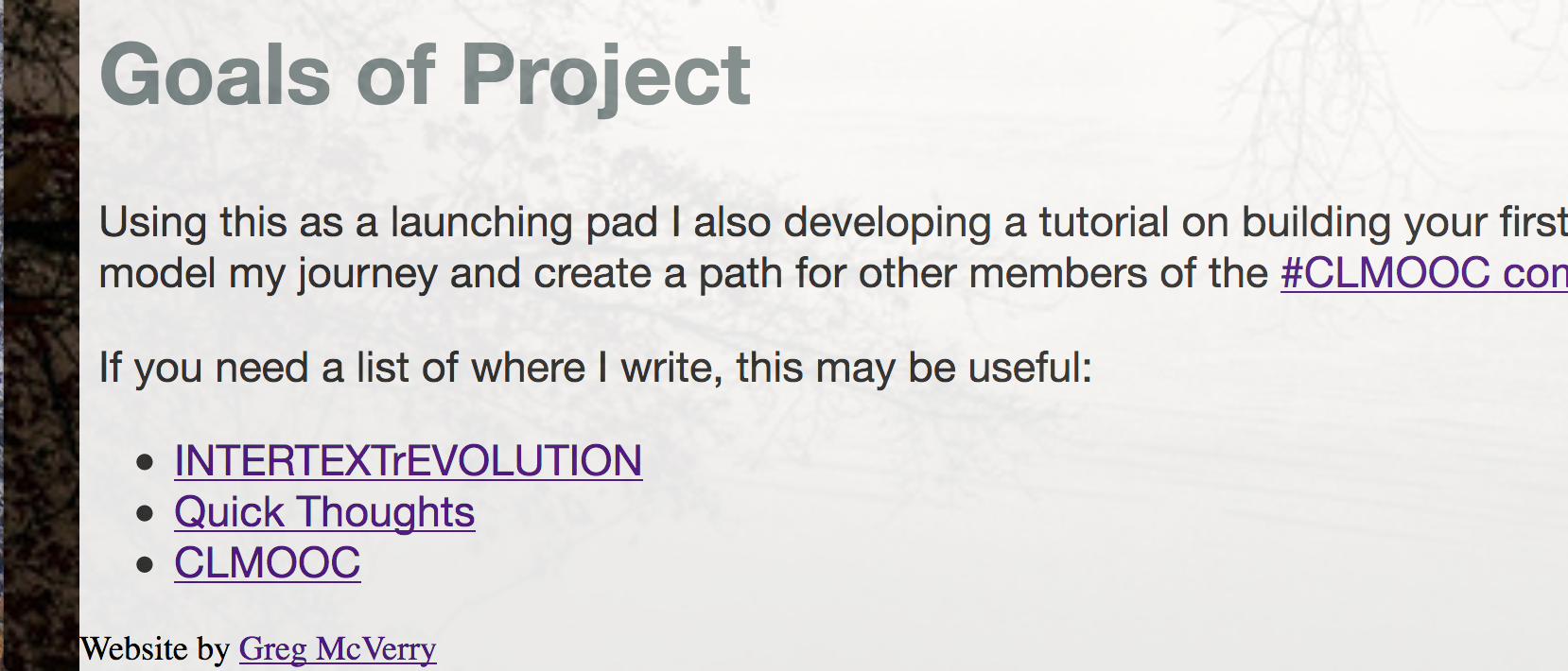
Choose a License for Your Footer
- Some people like to put a copyright notice in their footer.
- While you can choose to fully copyright your work many people use a Creative Commons License
- Please note no matter what license you choose the only way to ensure total ownership is to never share. Once you put something online you lose the control to delete every copy.
- Given that caveat many of us choose a creative commons to license to support a collective knowledge base for the good of humanity.
- Some, such as edtech critic Audrey Watters do worry about attack vectors or exploitation of labor with creative commons licenses.
- How you choose to license your material is up to you
- Creative Commons has a great tool to help you choose a license.
- Now paste the license code from the Creative Commons website
- For example I chose:
- This displays as:
- You now have a footer with author information and a license. You can stop there or move on to the next section to learn to style your footer
<a rel="license" href="http://creativecommons.org/licenses/by/4.0/"><img alt="Creative Commons License" style="border-width:0" src="https://i.creativecommons.org/l/by/4.0/88x31.png" /></a><br />This work is licensed under a <a rel="license" href="http://creativecommons.org/licenses/by/4.0/">Creative Commons Attribution 4.0 International License</a>.

Style Your Footer
- First we want to make sure the footer takes up the entire container so we add
- Next we will set the display to flex and once again use flexbox. We also want to start the footer at the left margin and have the content centered. So we add
- In the above screenshot you can now see the footer is now centered.
- You may want to add color to your footer to match the heaver and navigation
- Now our CSS rule will look like the the rule above. We set the text color to whiter with color: white; and the background color with
- Do you see how everything looks a little clumped together? We will had some CSS rules to space things out a bit.
                footer {

  width:100%;

                }
                footer {

  width:90%;

  display: flex;

  align-items: flex-start;

  justify-content:center;

                footer {

  width:90%;

  display: flex;

  align-items: flex-start;

  justify-content:center;

    background: #3498db;

  color: white;


}

              footer a {

   margin: 0px 10px 0px 10px;

                }

footer img {

  margin-top:5px;

}
Reflection and Sharing
Share a link to your page with your community. Explain what license you chose to include in your footer and let us know why.